
waku waku burger
添加时间:2020-03-11 05:39:21
浏览量:6616
设计欣赏相关观点
waku waku burger 位於台北市吳興街,是由兩位年輕男生共同成立的日式漢堡店。
品牌定調發想自業主喜歡的日本音樂 - 羊毛とおはな,
療癒、自然不造作的小品,更與業主給人的感覺相吻合。
根據以上特性,把品牌核心關鍵字定義為 簡約精緻、愜意(日常感)、雀躍。
手感的元素與低彩度的顏色外,材質也選擇有自然感的牛皮紙與溫潤的米白色紙張,
塑造自在隨性、質樸的感受。
排版上刻意留白的空間感是以視覺轉化店家的服務細膩之處:
舒適的空間、好吃的餐點,與客人之間是剛剛好的距離,不過度打擾。
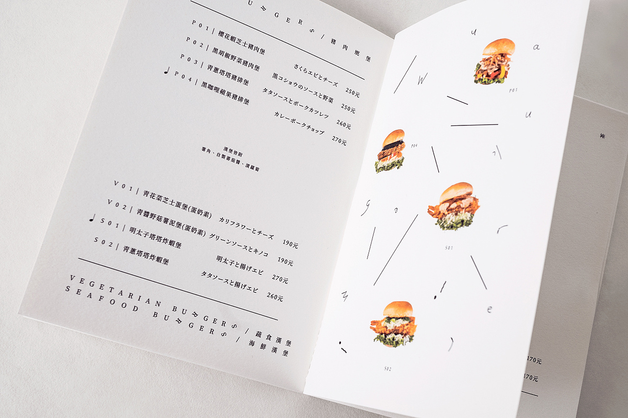
菜單考量閱讀性維持整齊乾淨,
細節上刻意歪斜的文字與漢堡照片彷彿隨著音律起舞,增添品牌俏皮的氣氛。
並且也將這些氛圍延伸到室內平面視覺的呈現,
讓來店客人感受到一如わくわく在日文中「扣人心弦的悸動」的含義,不禁由心底發出驚嘆!
**部份照片由waku waku burger提供
Waku Waku Burger is located on Wu Xing Rd. in Taipei city.
It is founded by two young entrepreneaurs with a Japanese style burger joint in mind.
The brand identity stemmed from the owners’ love for the Japanese band 羊毛とおはな.
A therapeautic, genuine and casual vibe of the music seamlessly integrate with the owners personalities.
Concluding these traits, we defined the key elements of the brand to be minimally elegant,
easy-going and cheerful.
Textures such as handmade ones and craft paper,
along with low saturation colors contribute to an overall natural and easy atmosphere.
Lots of negative space is deliberately made apparent to reflect on the owners’ take on good service
- that is, to provide a space of comfort, good food, but more importantly,
to keep a comfortable distance from patrons without pushy over-the-top service.
Taking legibility into consideration , menus are kept orderly and clean.
To introduce more fun elements, words and graphics were purposely tilted as if they are dancing.
The same technique is applied on graphics throughout the interior space
of the restaurant in hopes of eliciting a sense of excitement from patrons,
much in the same way as the name of the brand indicates
- to inspire a melodic experience.


上一观点: 科技公司画册
下一观点: 一个环保产品画册
我的需求和此项目类似 既刻与狼道联系 或请拨打 18053617900(微信同号)


专注于文化体系形象打造、品牌策略、VIS系统导入、宣传物料、网站电商及环境空间设计等相关美学及创意产业,以专业视野,为客户提供全方位的品牌设计及整合传播服务
狼道锐度其它业务单元
商业摄影 电商设计 展厅设计 广告及标识工程 文化墙打造
 潍坊市高新区健康东街怡和第一城C-N-17
 0536-2092060
 18053617900
 75176495
 langdao@lang-dao.com